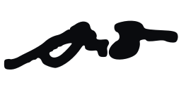
Logo
The face of our brand.








Core Colors
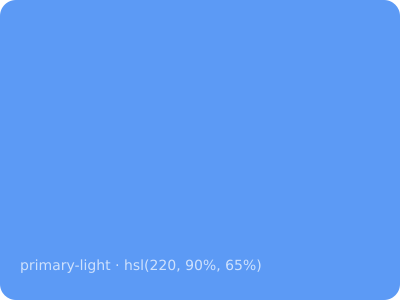
The palette that defines our visual identity. Dark theme only.
Primary Palette
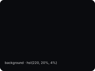
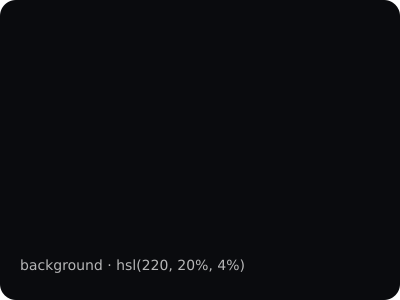
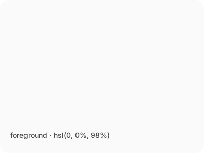
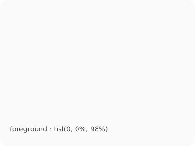
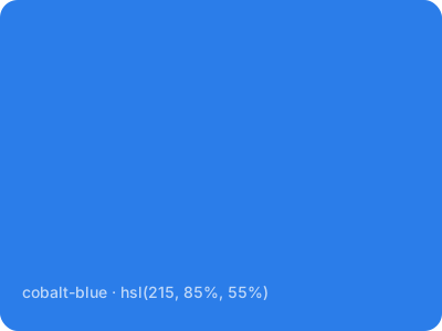
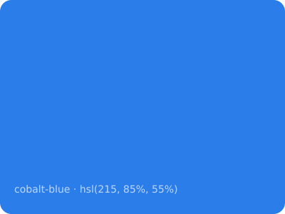
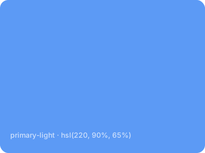
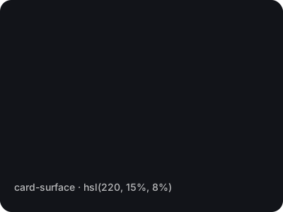
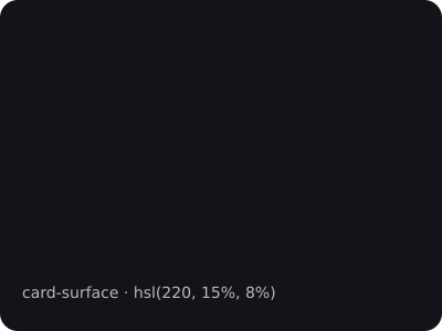
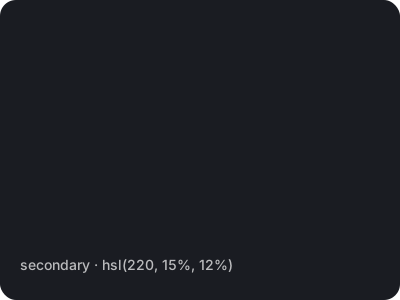
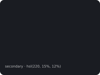
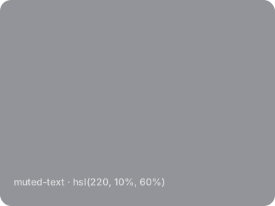
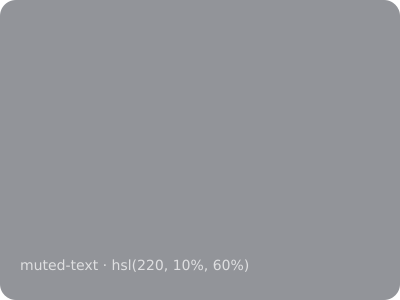
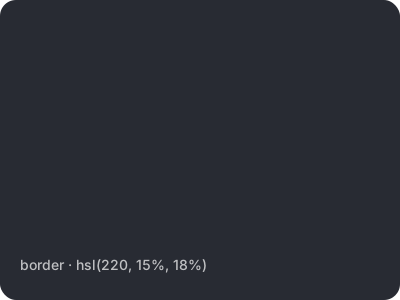
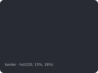
Surface & UI
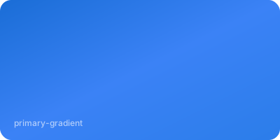
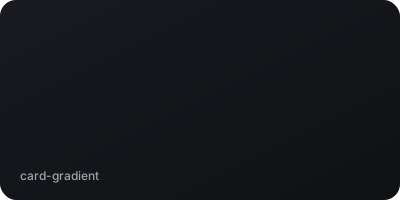
Gradients




Typography
Two typefaces that define the brand.
Headlines
Space Grotesk
Used for all headlines, headers, and navigation.
Weights: 400, 500, 600, 700
Usage: H1-H6, brand headers
Body Text
Inter
Used for paragraphs, descriptions, and UI text.
Weights: 300, 400, 500, 600
Usage: Body, captions, UI
Type Scale
Voice & Tone
Clear, direct, results-driven. The "No BS" approach.
Do
Don't
Logo Guidance
Reference these rules when using the Shawn Black identity.
Things to Avoid

Don't use light backgrounds
Don't change the color
Don't stretch or distort
Don't rotate
Don't use below 120px width
Don't add effects or shadows
UI Patterns
Consistent components across all touchpoints.
Buttons
Tags & Badges
Cards
Executive Coaching
1-on-1 strategic coaching for leaders who want real results.
AI Consulting
Practical AI strategies built for how you actually operate.
Strategic Planning
Clear roadmaps that hit your unique challenges head-on.
Iconography
Lucide icons at 24px, 2px stroke. Consistent across all touchpoints.
Style Rules
Library
Lucide React — open-source, tree-shakable, consistent geometry.
Size & Stroke
Default 24×24px with 2px stroke width. Use 20px for compact UI, 28px for feature cards.
Color
Icons inherit currentColor. Accent icons use text-primary. Never apply multi-color fills.
Icon Reference
Do
- Use Lucide React icons exclusively
- Place icons in rounded containers with bg-primary/10
- Keep consistent sizing within a section
- Use currentColor or text-primary only
Don't
- Use emoji as icons (🚀 💡 📈 🤖)
- Mix icon libraries (Font Awesome, Heroicons, etc.)
- Apply multi-color fills or gradients to icons
- Use icons smaller than 16px or larger than 32px
Photography
Visual guidelines for imagery across all platforms.
Subject & Setting
- Modern office, casual lobby, or boardroom settings
- Show Shawn as an engaged advisor, interacting with team
- Natural lighting, candid feel over posed shots
- Black quarter-zip with signature logo as standard attire
Treatment & Tone
- Dark overlays (60-80% black) for text readability on hero images
- Desaturated tones that complement the dark theme
- Parallax scrolling on hero sections for depth
- Avoid stock photos with forced smiles or generic handshakes
- Never use bulky silhouettes or overly stylized filters
Spacing & Layout
Consistent rhythm across all pages.
Base Unit
4px base unit. Scale in multiples: 4, 8, 12, 16, 24, 32.
Border Radius
Default: 12px (rounded-xl). Cards use rounded-2xl. Buttons use rounded-xl.
Section Spacing
Hero padding: pt-32 pb-20
Section padding: py-20
Card padding: p-6 or p-8
Container max-width: 5xl
Brand Architecture
The parent brand and portfolio companies.
Parent Brand
Shawn Black
Executive Coaching & AI Consulting
Portfolio Companies
OnyxFM
AI-Powered Facility Management
IFM, AI, IoT, Robotics, nationwide vendor network
Deployd
Custom Software for Trades & Services
AI-powered platforms for trades businesses
FacilityVibe
The All-in-One FM Platform
9-module SaaS platform for operations, CRM, sales, marketing, accounting